
Jan 21, 2015
Reading This Sign Breaks a Sweat
The Best Western in Big Bear has the oddest air conditioning/heating sign I've ever seen. And why is it placed next to a lightswitch?

Sep 13, 2014
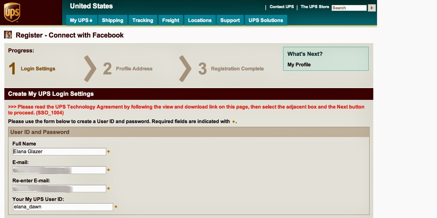
UPS? You be screwed.
UPS has got the have the poorest user experience and the worst error messaging. I've been trying for months to figure out the registration process.
 |
| Poor attempt at error recovery. |
 |
| No attempt at error recovery. |
Jul 24, 2014

Apr 28, 2014
OmniGraffle 6 Shortcuts
Some OmniGraffle 6 tips I recently shared with my UX team...
Shortcuts I Use the Most (aside from the usual save, copy, paste, etc):
Duplicate:
⌘D (TIMESAVER)
Easy Copy/Paste:
Option and click/drag item (Very useful)
Select All:
⌘A
Inspector sidebar (show/hide):
⇧⌘I
Fonts (show/hide):
⌘T
Color Palette (show/hide):
⇧⌘C
Paste without format:
⌥⇧⌘V (LIFE CHANGING. Works in most apps)
Make into a Table:
⇧⌘T (GREAT FOR MENUS)
Move to Front:
⇧⌘F
Move to Back:
⇧⌘B
Group:
⇧⌘G
Ungroup:
⇧⌘U
Next/Previous Canvas:
⌘ [ and ] OR Function up/down arrow
⇧ = shift
⌘ = command
⌥ = option
Shortcuts I’m Currently Learning (I try to learn a few new ones a month)
- special characters: cntrl + command + space
- show stencil: command 6
- start preso: option + control + p
- show/hide left panel: option + command + 1
- show/hide grid line: command + \
- next/previou scan vas: option [ and }
Other Tips:
- Hold shift when you drag an object to maintain the position
- Use the Combine Shapes tool
- OG 6 now has double stroke with full. Fun.
- "Scale text and shapes" is really helpful for converting full size wireframes into mini versions to show user flows
- Format objects with the chicklets
 |
| chicklets |
ALL TIPS:
In OG > Help > Keyboard Shortcuts (attached)
Apr 12, 2014
Reservations about Reservations
A well-designed website can reduce call volume to customer service, or at least direct users to the appropriate department.
I bet the "cute" 800-number for reservations on River Terrace Inn's website encourages travel planners to call the hotel directly and ask to be transferred. I know I was too lazy to decipher the code!

I bet the "cute" 800-number for reservations on River Terrace Inn's website encourages travel planners to call the hotel directly and ask to be transferred. I know I was too lazy to decipher the code!
Mar 10, 2014
Cancellation Fail
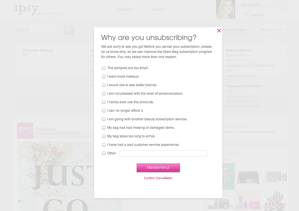
iPsy is a $10/month subscription-based site that mails out deluxe size beauty products on a monthly basis. While I enjoyed my short membership, I was leaving town for a few months and wanted to cancel my subscription.
Easier said than done. Below are a few usability pain-points I encountered on the long journey of cancellation.
Easier said than done. Below are a few usability pain-points I encountered on the long journey of cancellation.
- Users can't cancel when a monthly order is processing. I hope implementing a cancellation queue is on the product roadmap. Pretty poor UX requiring users to come back another day.
- Users must click through several modals before being able to cancel (see visuals below).
- While the main task is to cancel the membership, it's treated as the secondary CTA.
- The primary CTA cancels the cancellation process.
- Since using the word "cancel" to cancel the cancellation process would be confusing, they used "nevermind" - which isn't even a word.
- Once finally making it through all the modals, you have to click on a link in an email to actually confirm the cancellation.
- The email link takes the user to a landing page to sign up, rather than a page that displays a confirmation message.
 |
| Modal 1 |
 |
| Modal 2 |
 |
| Modal 3 |
 |
| Modal 4 |
 |
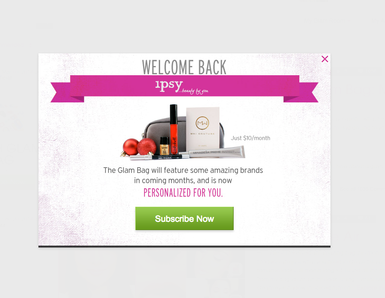 |
| Landing Page Clicking Through on the Email |
Jan 1, 2014

Sign In
I'm perplexed that Twitter doesn't have a link to "sign in" when you try to Follow someone and you aren't logged into the site. When this happens, you have to close the lightbox and click the sign in link in the upper right corner (which is easy to miss).


Clean but Confusing
I'm noticing a trend that places the search "submit" button/icon within the field itself. While I like the clean visual effect, I wonder if this confuses user. I know it confuses me when there's another, unrelated button next to the search field, per the examples below.
It took me a while to understand why the upload dialogue box displayed when I tried to search something on slideshare.com. NOTE: It seems that slideshare.com has increased the space between the search field and upload button since this screenshot was captured.
A colleague of mine kept hitting "new project" when trying to search for a project on InVision.
 |
| invisionapp.com |
Nov 8, 2013
"Internet is the Future" - 1996
A class presentation from 1996 for a Ugrad marketing class... Some people in the class didn't know what the internet was!


Nov 4, 2013
Penis. I mean Pencil.
Today I helped a friend/colleague research how eComm sites display search results. We were documenting the results page for terms like "shipping" vs "skirts" and "returns" vs "tory burch".
It was towards the end of a long day (goodbye daylight savings time) and my colleague found herself at this page:
.png)
It was towards the end of a long day (goodbye daylight savings time) and my colleague found herself at this page:
.png)
To the Left. To the Left. There's a Broken Image in the Box to the Left.
I tried to sign up today with my company's paycheck provider, but found myself unable to complete this required registration field...
(Title references Beyonce's Irreplaceable lyrics)

Nov 3, 2013
You Can Flip It. But Don't Try To Use It.
I'm sure the designers thought that they were really clever in designing this 2-in-1 remote. But you have to wonder - did they actually watch a user use it?? It's nearly impossible to not accidentally press a button on the flip side.
 |
| Side 1 |
 |
| My friend modelling side 2 |
Oct 24, 2013
Mixed Messages
A red error message doesn't go with a green check mark.
 | |
| Sign in page on Southern California Edison (sce.com) |
Oct 14, 2013
I Don't Wanna Fly
If I wanted to fly, I'd go to expedia, kayak or google flights. I'd be a little more tolerant if the "fly" promo was off to the side and not cluttering the driving options.

Oct 12, 2013
Check in a Box
I just came across these photos from a couple of years ago... Great presentation of the check at a library-themed lounge in West LA (Wellesbourne). Almost makes you look forward to paying. I said almost.


Sep 30, 2013

Sep 14, 2013

Aug 11, 2013
Ok? Circle!
Don't judge: I'm slightly obsessed with point of sale credit card hardware/software systems. Every store has one. Most people encounter at least one on a daily basis. The experience should be fairly intuitive and straightforward. However, one of the biggest mysteries of modern technology is how so many vendors get the user experience wrong.
This is a photo from H&M that I captured earlier today. Note that the screen is asking me to confirm a purchase. My first reaction was that I was digging the conversational tone of the message. Then my eyes searched for a nice big green "OK" button. There was none to be found. Then I scanned for a "Yes" button. Nope. Hmm I was stumped. Turns out the circle button was the correct one to press. Seriously???

This is a photo from H&M that I captured earlier today. Note that the screen is asking me to confirm a purchase. My first reaction was that I was digging the conversational tone of the message. Then my eyes searched for a nice big green "OK" button. There was none to be found. Then I scanned for a "Yes" button. Nope. Hmm I was stumped. Turns out the circle button was the correct one to press. Seriously???

Aug 6, 2013
Amber Alert
There's something about the Amber Alert system that makes me feel connected to the rest of civilization. However, the is NOTHING civilized about the sound that an Amber Alert made on my phone the other day. In fact, I was just falling asleep and it scared the heck out of me!!!
I contemplated turning the notification off but decided that a momentary freak out (to put it mildly) is worth the price of possibly saving a child. However, honestly - there is no need for that startling sound. Not to mention that there was no call to action as to what to do!


I contemplated turning the notification off but decided that a momentary freak out (to put it mildly) is worth the price of possibly saving a child. However, honestly - there is no need for that startling sound. Not to mention that there was no call to action as to what to do!


Subscribe to:
Posts (Atom)